Related Projects


- Client: Seiko Canada
- Type: Print Design
- Link: View Project
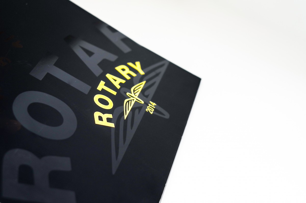
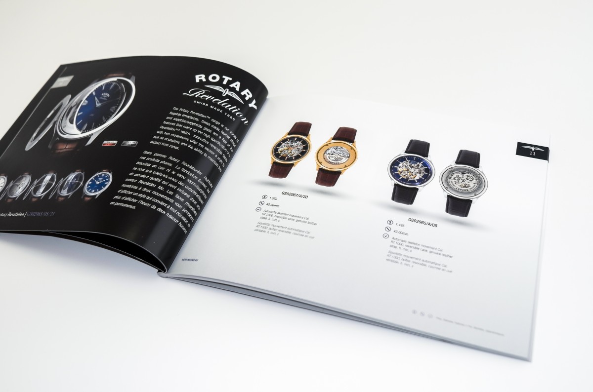
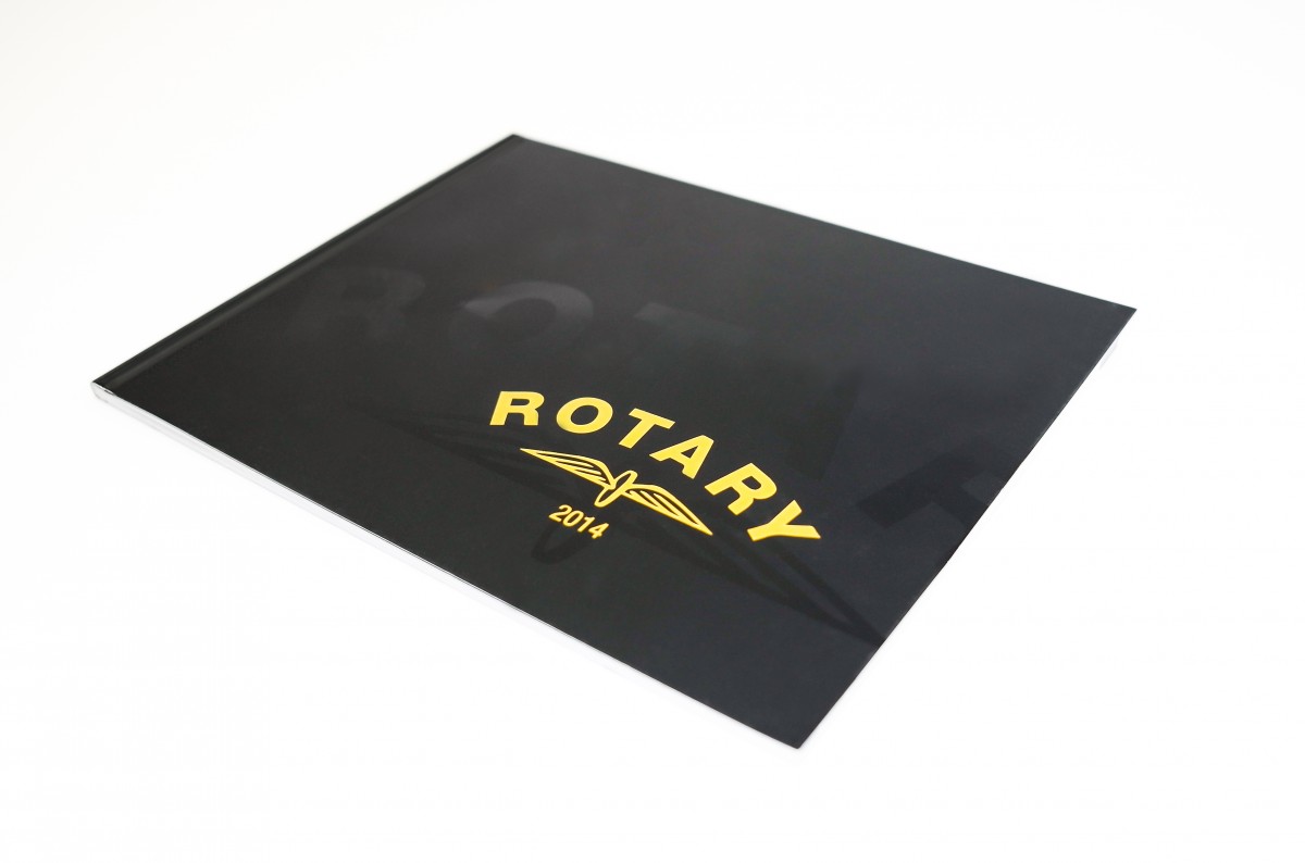
Seiko Rotary 2014
We design with the intent to create a finished product that is tangible, impactful, and beautiful. For Seiko, we achieved the difficult task of creating a product brochure that was shy on clutter, and highlighted the elegance of their brand specific Rotary watches. From the onset, one is introduced to a cover design that features layers of premium print finishes such as spot UV and gold foil die stamp to illicit logo imagery that indicates this brand is in a class of its own. As we design for more than just eyes, the theme carries onto the feel of the book. The luxurious soft touch AQ coating throughout communicates that “yes, details matter” to the exclusive Rotary brand. Coincidentally, it just so happens that fine attention to detail and quality workmanship also matter too.